
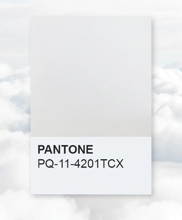
Last year’s color of the year from Pantone was “Mocha Mousse,” aka a light, soft brown. At the time, I noted that it was hard to get excited about such a muted tone. 2026’s Pantone color of the year presents even more of a challenge for which to muster enthusiasm. This year’s color is entitled “Cloud Dancer,” which sounds whimsical at first, but looking at their website, it comes across more like a dull white. Pantone, however, describes it as “a lofty white that serves as a symbol of calming influence in a society of rediscovering the value of quiet reflection.” Which I would say is a generous description that’s quite possibly fully up its own butt. However, in the interest of journalistic integrity, let’s explore the potential of incorporating Cloud Dancer into 2026.
If you visit the Pantone website, it’ll provide links to all sorts of ways to experience Cloud Dancer through their various collaborations. You can “curate your calm space” with a couch from Joybird. If you’re traveling this season to New York, Geneva, or Dubai, book a room at the Mandarin Oriental and check out their curated Cloud Dancer experiences, like high teas, wine tastings, or spa treatments. These two collaborations are majorly high-end, so for more low-key scenarios, there are Cloud Dancer Post-Its, Command Spring Clips, and Wire Hooks, the color interpreted as a scent from Pura, and for the kiddos, Cloud Dancer Play-Doh.
Of course, not everyone has the budget or the inclination to support branded collabs that, in essence, promote literal whiteness. However, if the idea of bringing freshness, light, or a blank clean slate appeals to you, you can certainly take inspiration from Cloud Dancer. Painting comes to mind, especially if looking for an interior refresh. Sherwin -Williams Snowbound shade mirrors Cloud Dancer. You can order peel-and-stick paint samples to throw on the wall and test. For any reorganization projects this winter, also consider freshening up the inside panels of closets, cabinets, or bookshelves with a coat of Snowbound or Greek Villa, which also hints at the Cloud Dancer tone.
If you’re looking for an inspired scent, the Pura products from the official partnership with Pantone boast hits of magnolia, musk, and sandalwood with undertones of bergamot. If you mix your own essential oils, you can create a similar scent with these aroma notes either in perfume form or for candles. For those of us not the best at DIY scents, there’s Atum’s White Sands Travel spray, which features notes like dry desert sage and orange florals. For something on a sweeter side but still Cloud Dancer adjacent, there’s Le Monde Gourmand’s Fleur De Blonde eau de parfum with a pear blossom top note, a violet layer, and a base of cashmere musk. For an option with a richer fragrance in non-perfume form, there’s Future Society’s Floating Forest Scented Candle that brings out the bergamot, with water lily, and base notes of salted musk and driftwood. This reads like the perfect home scent to lighten up dark winter nights.
In terms of Cloud Dancer-inspired looks this season, I think an all-white ensemble is hard to pull off and far from practical in the snow and slush. That said, outfits that intentionally incorporate shades similar to Cloud Dancer can help freshen winter looks. Again, if you check out the Pantone site, it offers examples of color palettes to showcase and enhance Cloud Dancer and other white shades. These palettes can also be applied to interior designs and, in some cases, cosmetic looks. For outfits, the palette I’m most drawn to is their Light & Shadow color panel. This color display consists of soft hues like a matte mint green, a fuzzy-feeling coffee tone, and a muted cobalt blue. These contrast with shadowy shades like a dusky violet, dark slate blue, and a sandy brown with mauve undertones. I wouldn’t recommend incorporating the whole panel into one outfit; instead, look to your current closet to see which pieces you already own that you can style in new ways inspired by this palette. A white button-down, navy trousers (or jeans), a cozy brown cardigan, a camel belt with matching loafer, or blue sneaker, with an accent color of a scarf, and voila, you’re trending with Cloud Dancer.
The other palette Pantone suggests is entitled Powdered Pastels, which, as the name implies, is made up of a peach shade, rose-pink, light grey, lemony yellow, and other quieter pastel versions of blue and green. I don’t see this so much for outfits, but definitely for interiors and décor. This panel has the potential to inspire wall color and accent pieces, such as pillows and vases. I also see this as the beginning of a mood board for Easter décor come spring. These pastel shades can also work as inspiration for makeup or nail color, again for spring.
In the grand scheme of things, the color of the year is, at its core, a marketing campaign. You can eye-roll at the blandness of this year’s shade, scoff at the capitalistic undertones, or have a cursory interest and perhaps be a bit inspired to make a few aesthetic changes in 2026.