Upgrading your home design is an opportunity to tap into new color schemes. Knowing what shades are trendy and how different hues can work together for a cohesive design is an important step in creating an attractive design aesthetic.
While you might turn to family or friends for inspiration for your next DIY project, another resource for collecting concepts and options to upgrade your space is the internet. Consider the Valspar Color-verse, which allows visitors to explore colors in a unique way and offers paint color inspiration and decor trends they can envision within their own homes.
After experiencing the Valspar 2023 Colors of the Year firsthand by painting walls and art from the collection to see the 3D virtual house come to life, you can find the perfect paint shade for your space.
“Through the Color-verse, visitors can experience the 12 Colors of the Year in a realistic virtual home,” said Gus Morales, vice president of brand marketing for CBG Sherwin-Williams. “Aside from exploring the Colors of the Year, the home is an engaging space for visitors to create art, play games and order paint chips to see how their top color picks look and feel in their homes.”
Color Trends to Consider
Many of this year’s popular nature-inspired designs are all about finding comfort, embracing a flexible lifestyle, rediscovering joy and leaning into the growing DIY movement. The most trend-worthy, forward-thinking and livable colors reflect specific facets or emotions of life so you can update your well-used spaces with thoughtful colors that evoke positive energy and lasting change.
Comfort and Contentment: If your goal is to create a space that envelopes you in a sense of comfort, consider a white with a yellow undertone that makes a space cozy like a soft blanket, like Cozy White from Valspar. Complement the softness with a muted clay that brings in brown undertones that suggest gentle contentment.
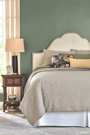
Calming Restoration: Tap into the calming tones of nature with a hazy green that has duality, which brings in both the calm and liveliness of the great outdoors. Another option is a deep midnight blue used as an elegant calming shade to restore mind, body and home.
Healthful, Mindful Living: Create an uplifting space where your wellness is a priority. Evoke a greater sense of health consciousness with a light blue that has a dose of softness used as a fresh neutral with uplifting qualities of a modern pastel, like Valspar’s Rising Tide. Reinforce the benefits of mindful living with a cool gray that is balanced by the warmth of the yellow undertone, a natural hue like a cotton muslin cloth.
Connections and Joy: Establish spaces where you can celebrate relationships with others, the world around you and happiness in your being. Consider hues like a white softened by a violet undertone, a harmonious shade promoted by digital connectivity. Evoke joy with a dependable classic tan that features a yellow undertone suggesting new life with uplifting qualities.
Natural Balance: Bringing hints of the outdoors into a well-loved living space creates a soothing ambiance. Consider a warm neutral brown tone inspired by the shades found in nature or a cooled down blue that strikes a beautiful balance between cool and warm shades in your design.
Inspirational Thought: A work-from-home or crafting space needs color to inspire great thinking. Try a faded natural terracotta that sparks individuality and warmth or a deep blackened olive, an on-trend neutral that embodies charm and sophistication. (Family Features & Valspar)


